A book about music and the color blue.
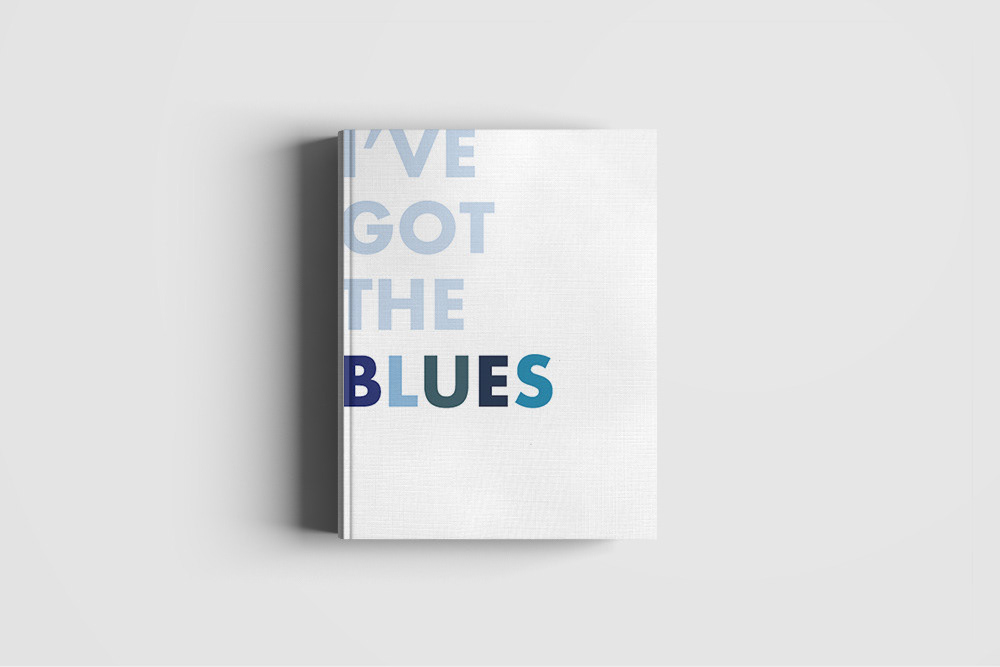

The color blue is present in many song titles and lyrics along with being its own genre of music (blues). This book explores the history of a selection of songs that include the word "blue" in their title.
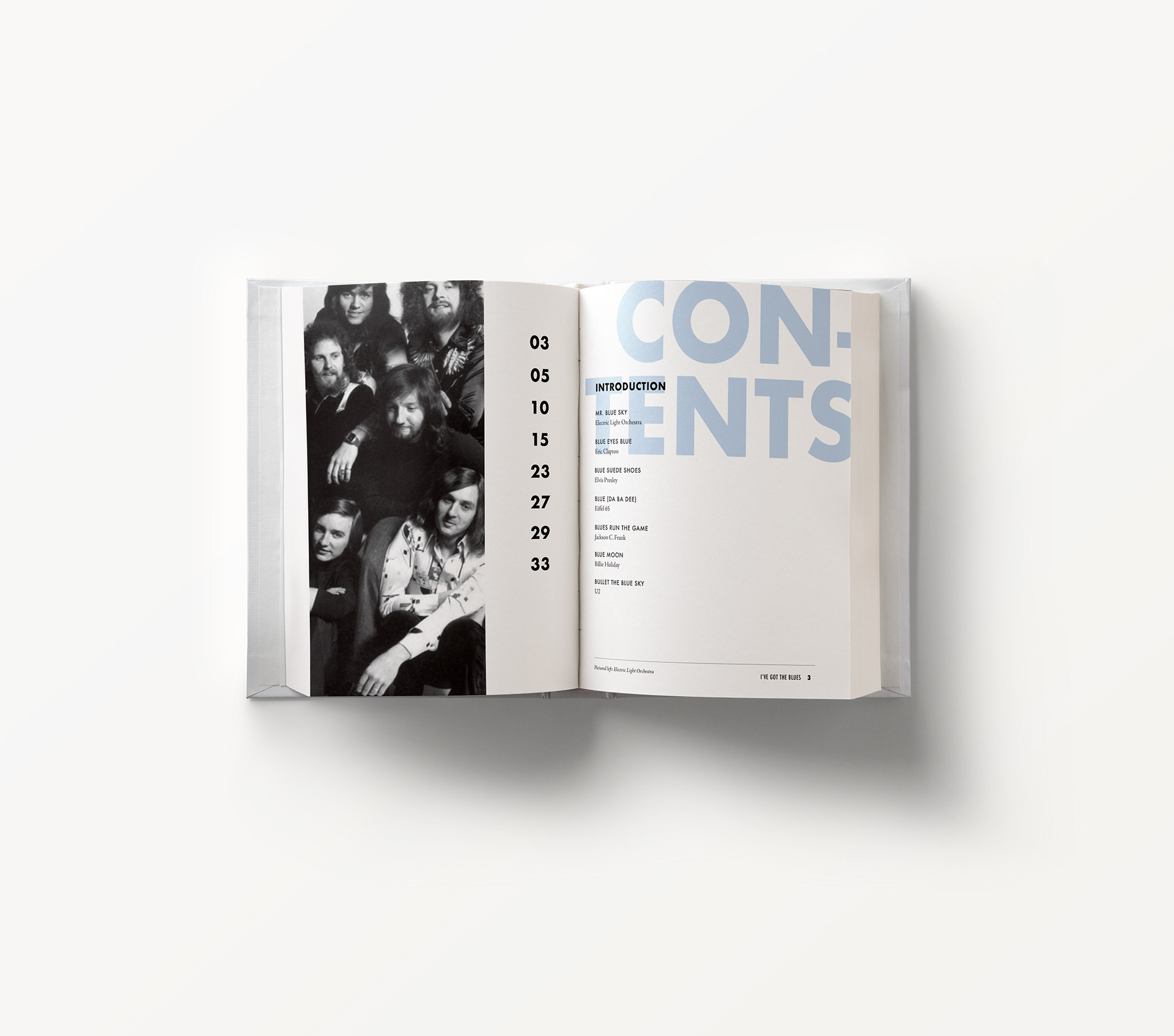
A theme that I repeated throughout the design of the book was a soft muted blue color and a sampling of various shades of blue. In the table of contents, the large letters are repeated in a more subtle fashion so that the contents of the book can shine.
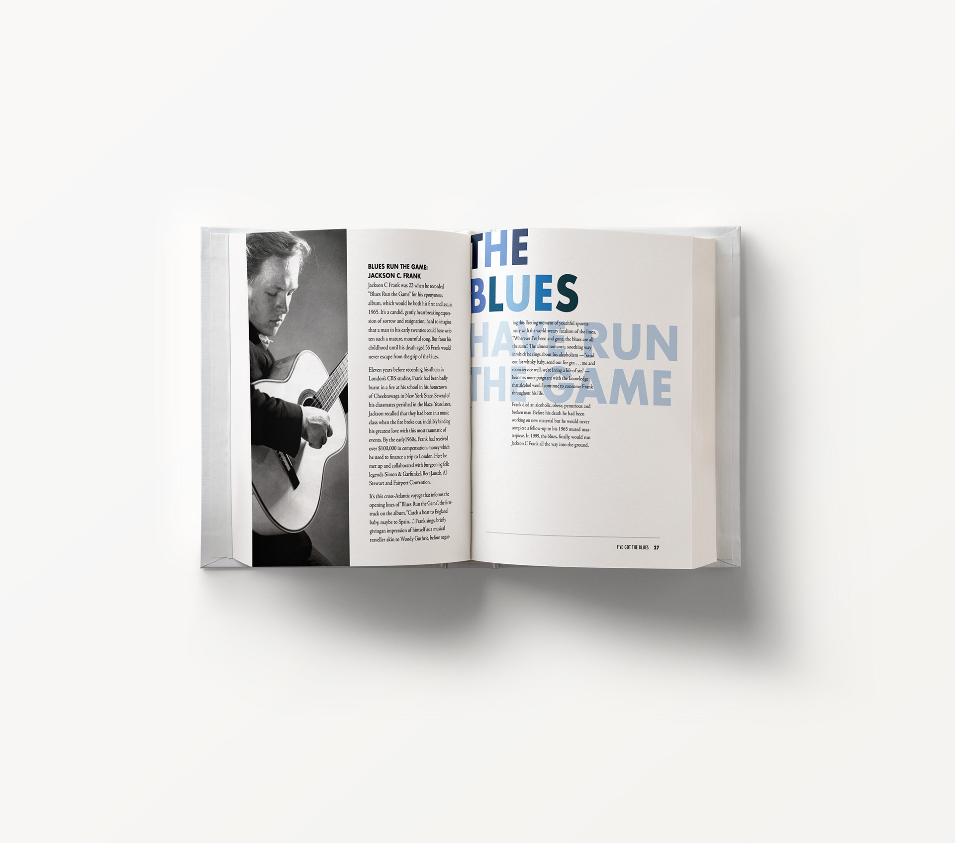
The opening spread for each article displays an excerpt from the song being featured in bold colorful letters. I think this is an effective way to catch the reader's attention and lead them into the article.
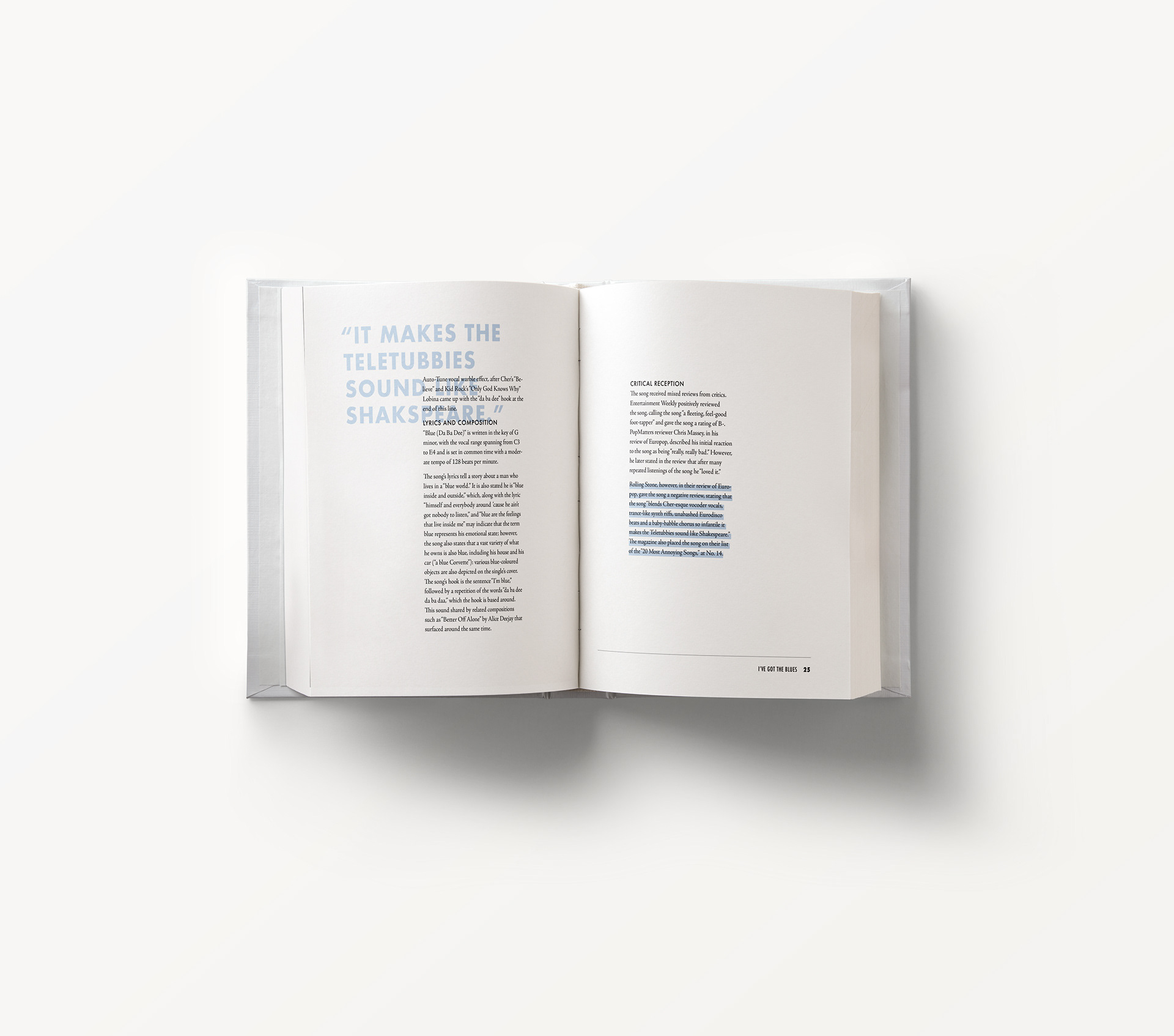
In contrast to the large bold letters on the opening spread, I wanted the follow up spread to feel a bit softer while still remaining visually interesting. Here, I treated the block quote much like the main text in the table of contents. It remains legible being nested behind the body copy because of the light blue color but still stands out because of weight of the letters.
For this article spread, I repeated the overlapping text theme and the large block letters featuring song lyrics. I formatted the photograph like the one on the table of contents by cropping it and spacing it out from the text.