BYU-Idaho publishes a promotional booklet to help inform prospective students about the University. I was tasked with the re-design of the previous view book. I focused on creating and designing content that related to the target audience while still retaining the University's simple and dignified brand identity.
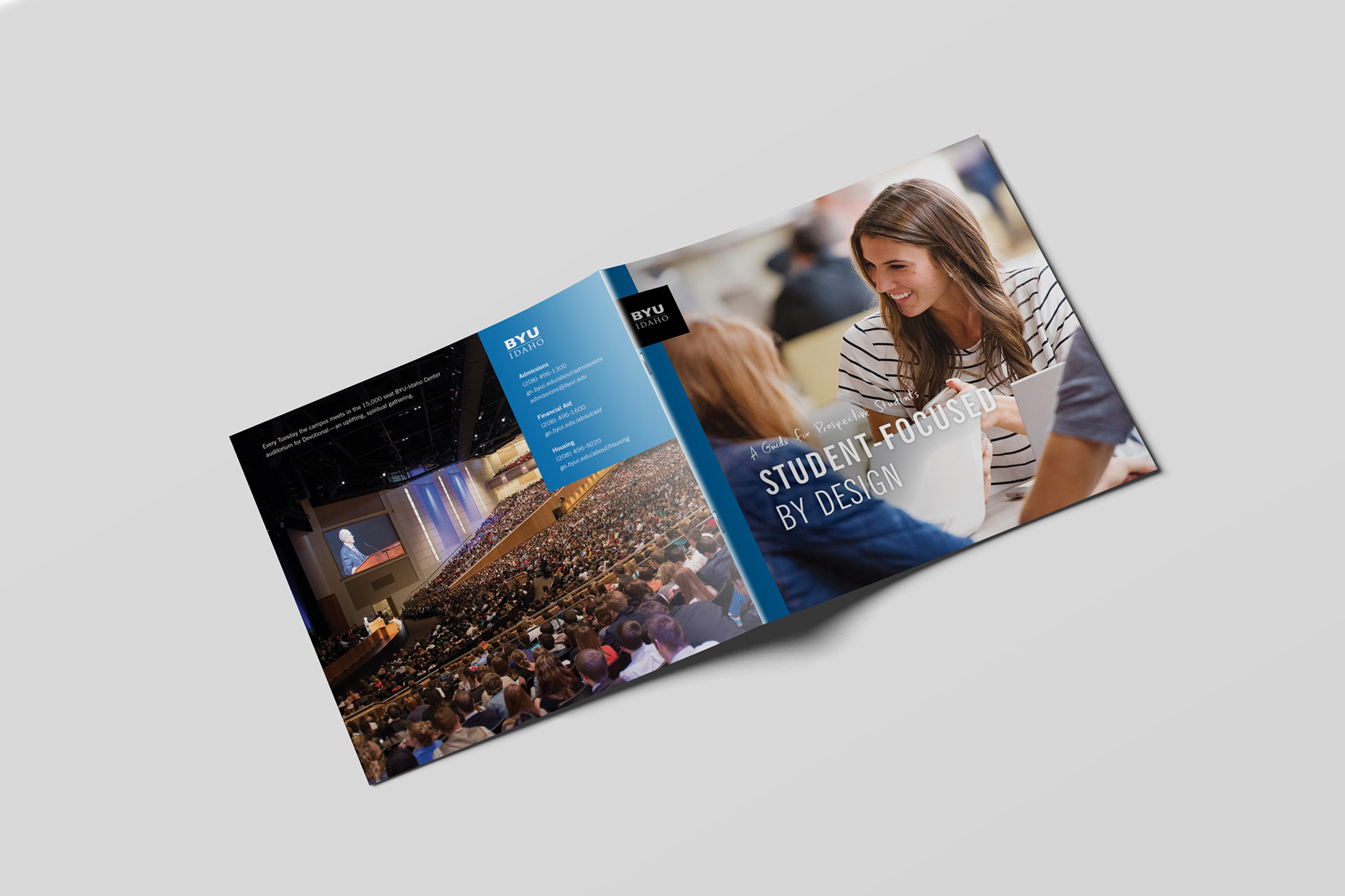
FRONT AND BACK SPREAD
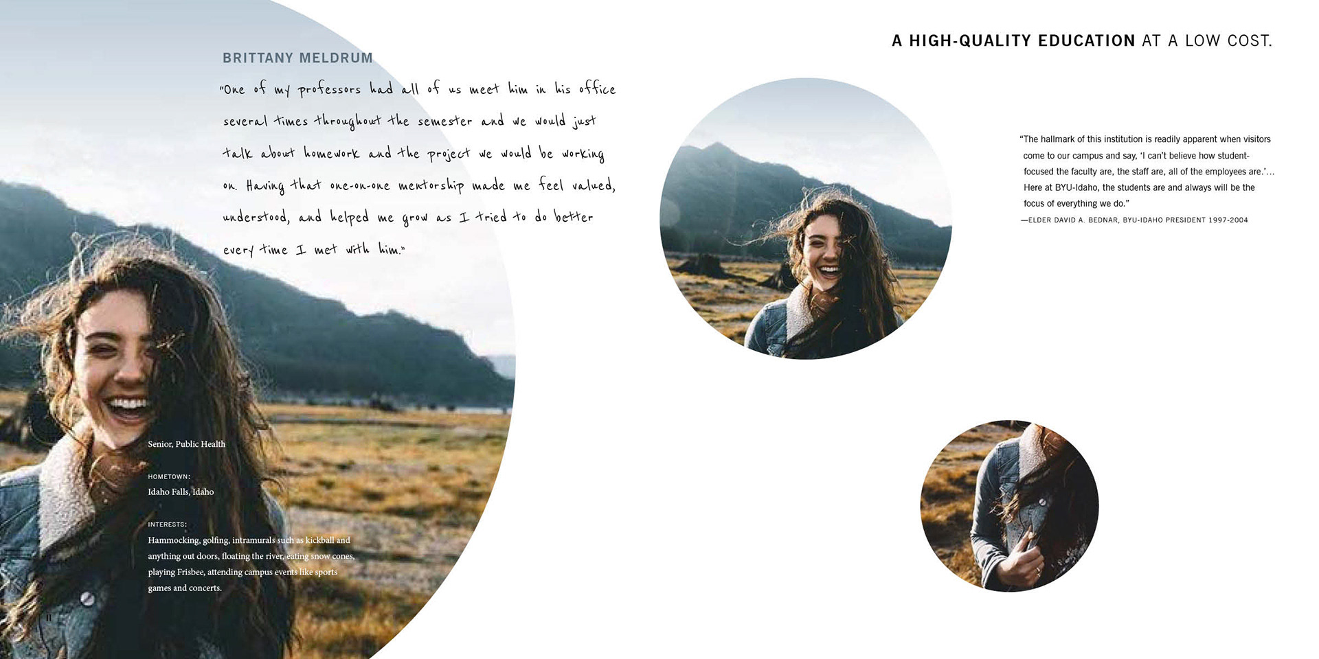
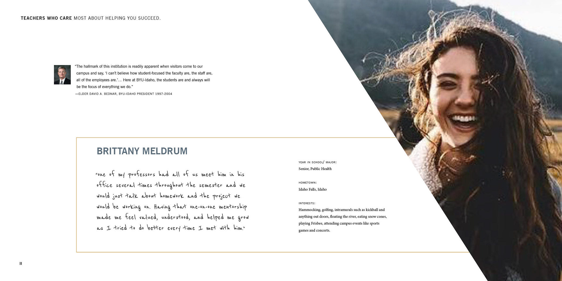
STUDENT SPOTLIGHT

CAMPUS FACTS SPREAD
ACADEMIC SPREAD
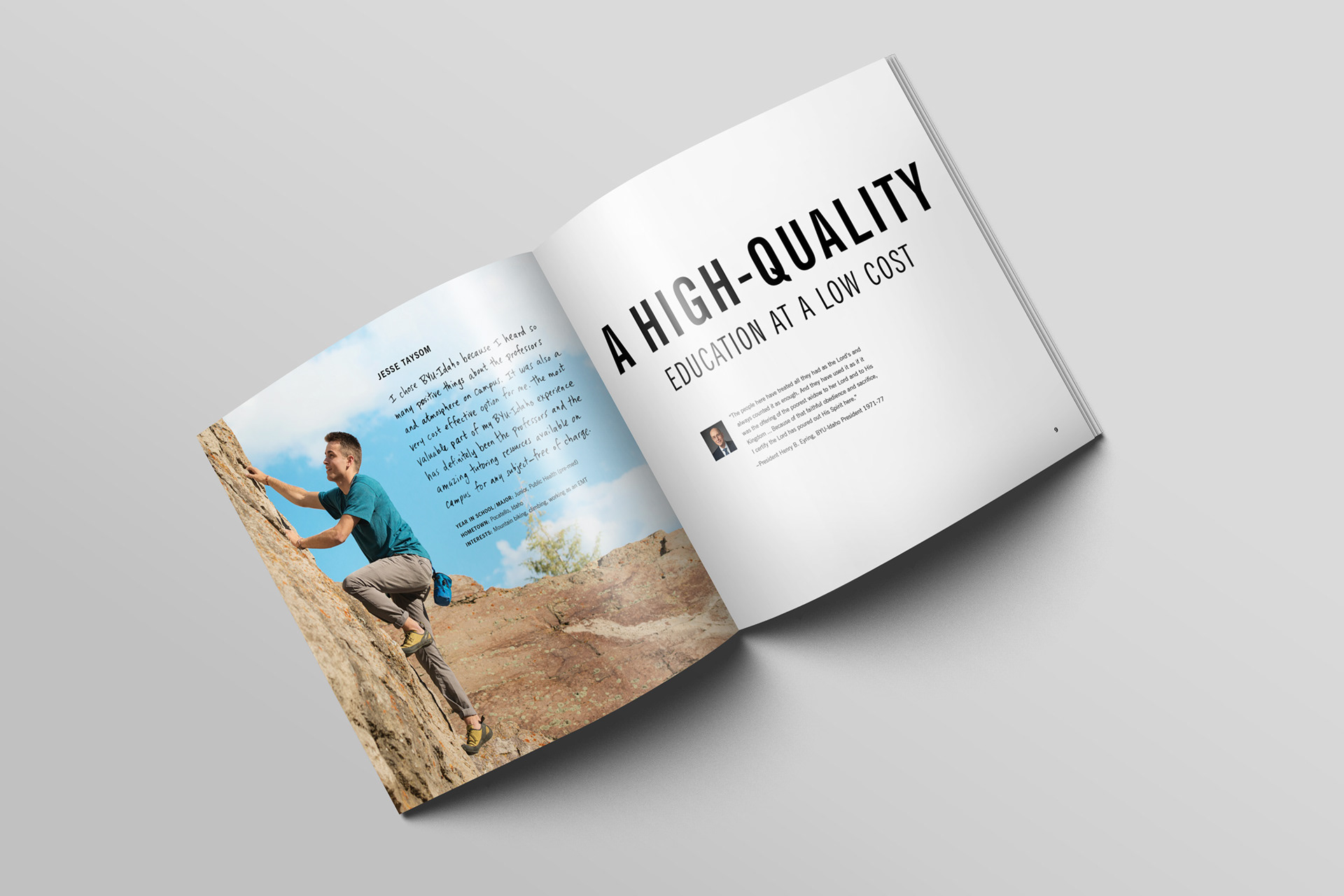
The photography style within the view book aimed to showcase student life in an exciting, natural, and relatable way. This direction was different from the photography in previous view books which had a more posed style.
Each student spotlight quote was handwritten to reinforce relatability within the view book. Section headers were set in bold, all-caps type that stayed true to the brand identity while giving the view book a fresh, youthful look.
I designed a new set of icons to go along with facts about the campus. These new icons utilized brand colors and a casual, illustrative approach.
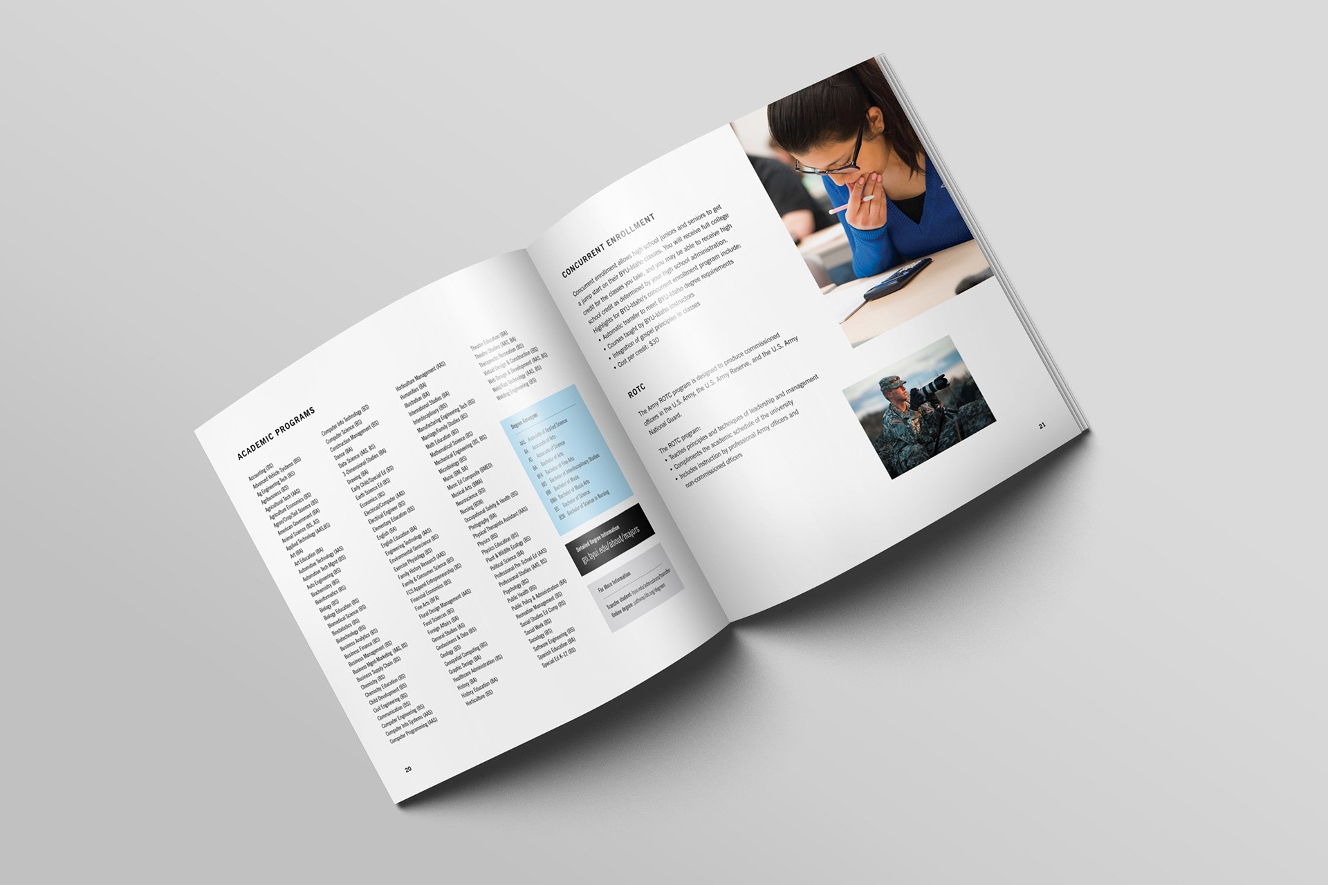
An essential element of the University view book is showcasing the variety of academic programs that are available to students. I organized all of the available majors alphabetically and used a key to help prospective students see which degrees are applicable.
VIEW BOOK SKETCHES
These rough digital variations inspired the direction of the final view book design.